
Anatomy of the Macro Readout
The complete recipe behind the GMI Macro Dashboard — the regime, the Macro Grade, and every rule that computes them from the government's own numbers. Published in full, same as the stock grade: a readout you can't audit is a readout you shouldn't trust.
flowchart LR
    FRED[FRED API<br/>38 government series<br/>full history, every run] --> ENG[Beta engine<br/>daily + release-aware<br/>revisions auto-absorbed]
    ENG --> GROW[Growth impulse<br/>45 payrolls / 35 consumer<br/>20 industry]
    ENG --> INFL[Inflation axis<br/>core PCE + CPI bridge]
    GROW --> REG[Regime 1-4<br/>instant flip,<br/>published rules]
    INFL --> REG
    ENG --> GRADE[Macro Grade<br/>50 + seven factor bands<br/>clamp 0-100 -> letter]
    ENG --> ML[ML forecasts<br/>1/2/6-mo horizons<br/>widening confidence]
    REG --> DASH[Macro Dashboard<br/>verdict -> derivation -><br/>themes -> source data]
    GRADE --> DASH
    ML --> DASH
The GMI Macro Regime — Two Questions, Four Answers
The regime asks two questions of the economy, each with published arithmetic:
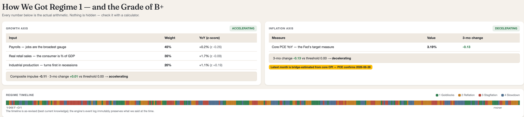
Is growth accelerating? We blend three monthly gauges into one growth impulse, weighted by what each actually measures: payrolls 45% (jobs are the broadest gauge in economics), inflation-adjusted retail sales 35% (the consumer is two-thirds of GDP), and industrial production 20% (a small slice of the economy that turns first in recessions). Each gauge's year-over-year change is standardized against its own 10-year history so no single series dominates on units. The direction test measures acceleration directly: the weighted 3-month change of the gauges' YoY values, each in units of that gauge's own typical variability — positive means accelerating. The Chicago Fed's CFNAI is displayed beside our composite as an independent cross-check (disagreement is shown, not hidden), and quarterly GDP anchors the monthly story.
Is inflation accelerating? Core PCE year-over-year — the measure the Fed's 2% target actually refers to — with a 3-month change test against zero. Because PCE publishes a month later than CPI, the weeks in between use a CPI bridge: the newest core-CPI month, adjusted by the latest CPI-to-PCE spread. Bridge-estimated readings are marked on the dashboard — loudly, on the regime card itself — and true up when PCE lands.
| Inflation cooling | Inflation accelerating | |
|---|---|---|
| Growth accelerating | Regime 1 — Goldilocks | Regime 2 — Reflation |
| Growth decelerating | Regime 4 — Slowdown | Regime 3 — Stagflation |
The regime flips the moment the arithmetic flips — no smoothing, no judgment calls. That's defensible precisely because the drill-down shows exactly which number crossed which line. This four-quadrant growth-and-inflation framework is the one institutional macro funds trade real money on; ours is computed independently from public data, with the recipe on this page.
The Macro Grade — Exact Draft Bands
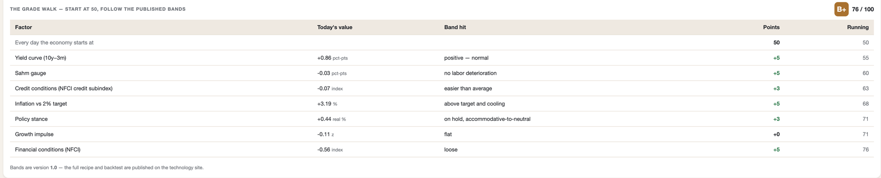
Same mechanic as the stock grade, so you already know how to read it: the economy starts every day at 50 points, earns or loses points across seven factors, clamps to 0–100, and maps to the same letter scale. It measures how favorable conditions like these have historically been for stocks — a measurement, never a directive.
| Factor | Frozen v1.0 bands (points) |
|---|---|
| Yield curve (10y−3m Treasury spread) | > +1.5 → +10 · +0.5..+1.5 → +5 · −0.25..+0.5 → 0 · −0.5..−0.25 (inverted) → −5 · < −0.5 (meaningfully inverted) → −10 |
| Sahm gauge (unemployment rise vs 12-mo low) | < 0.20 → +5 · 0.20–0.34 → 0 · 0.35–0.49 → −5 · ≥ 0.50 (the recession trigger) → −10 |
| Credit conditions (Chicago Fed NFCI credit subindex) | < −0.3 → +5 · −0.3..0 → +3 · 0..+0.3 → 0 · +0.3..+0.6 → −5 · > +0.6 → −10 · tightening > 0.2 in 3 mo → −5 more (floor −10) |
| Inflation vs 2% target (core PCE YoY + direction) | 1.5–2.5% → +10 · 1.0–1.5% or 2.5–3.5% cooling → +5 · 2.5–3.5% rising or 3.5–5% cooling → 0 · 3.5–5% rising or < 1% → −5 · > 5% → −10 |
| Policy stance (Fed direction + real rate) | cutting, real ≤ 1% → +10 · cutting → +5 · hold, real < 1.5% → +3 · hold, tighter → 0 · hiking, real ≥ 1% → −5 |
| Growth impulse (the composite above) | > +0.5 → +10 · 0..+0.5 → +5 · −0.5..0 → 0 · −1.0..−0.5 → −5 · < −1.0 → −10 |
| Financial conditions (NFCI) | < −0.3 → +5 · −0.3..+0.3 → 0 · +0.3..+0.7 → −3 · > +0.7 → −5 |
In the product, the grade badge's drill-down walks these factors with today's actual values and a running sum — the stock dashboard's worked-example treatment, applied to the whole economy, recomputed every run.
What the Calibration Found — Warts Included
- 2001 recession: warned. The grade fell from 70 into warning territory (≤40) in November 2000 — five months before the recession began.
- 2008 recession: deteriorated but did not warn. The gauge fell roughly 20 points into the recession's doorstep, entering January 2008 at 52 (a C−) — clearly weakening, above our warning bar. The Fed's rescue cuts and a still-tight labor market propped the score. We publish this rather than tuning until history looks prophetic.
- 2020 recession: unwarnable, and we won't pretend otherwise. The economy scored in the 80s through February 2020. COVID was an exogenous shock no macro gauge predicted.
- One false-alarm era: the 2022–24 deep inversion produced our only warning stretch not followed by recession — in the company of essentially every yield-curve model in existence.
- The regime axes needed no tuning: 354 months split 84 / 96 / 87 / 87 across the four regimes — naturally balanced.
Methodology notes: computed on current-vintage FRED data (revised figures, not point-in-time prints — a mild flattering bias we disclose rather than hide); the modern window contains only three recessions, so these are behavioral checks, not statistical proof. The claim this supports is the one we make: the grade behaves the way its ingredients are known to behave.
What This Recipe Claims — and What It Doesn't
- It claims the grade behaves the way its ingredients are known to behave. The yield curve and Sahm gauge are the literature's most famous recession indicators; assembling them with published arithmetic is the point. We will never claim the backtest "would have warned you" — the modern sample contains only four recessions, and honesty about small samples is part of the recipe.
- Forecasts are statistical trend extrapolations, not oracles — and they are graded in public. Every ML forecast ships with an 80% confidence range that widens with distance. Every projection (indicators and commodities) is written to a ledger the day it is published, counted once per month of data however many mornings it is republished, and graded only after its target month has ended and printed. The report card answers three separate questions: was the range honest (about 80% of actuals should land inside — the card refuses to judge under ten resolutions, then calls bands narrow or wide against a two-standard-error tolerance), was the direction right, and did the midpoint beat simply assuming the last print holds. Misses sit beside hits, and actuals are latest-revised values — disclosed as the kinder standard.
- Revisions are embraced, not hidden. The engine refetches every series' full history every run, so government revisions flow in automatically. History is shown as-revised; an immutable log preserves what we said at the time; divergences are marked.
- Everything is descriptive, never prescriptive. The dashboard reports what conditions are and what conditions like them have historically meant. It does not tell anyone to buy or sell anything — by design and by rule, enforced mechanically down to a lint on the AI-written narrative.
- Data provenance: FRED (Federal Reserve Bank of St. Louis), free and public — payrolls from BLS, GDP from BEA, rates from the Fed itself. Zero licensed data series. No human can edit a number between the government's release and the dashboard.
Why Publish the Whole Recipe
Same reason as the stock grade: the moat isn't the arithmetic — it's the machine around it. The release-aware engine, the revision-proof full-refetch pipeline, the calibration harness with enforced out-of-sample discipline, and the drill-down that runs from a one-word verdict to the government's own source rows. Institutional shops sell macro regime signals behind paywalls and never show the math. We publish the math, because the user's ability to check our work is the product.