
Applied Data Science
The statistical machinery under the grades: standardization, regime classification, calibration against history, time-series forecasting, and a point-in-time study design that refuses to cheat. The organizing principle everywhere is the same — measurement over prediction, and every methodological wart printed on the label instead of tucked under it.
The Discipline in One Paragraph
GMI's analytics never claim to know the future. Every statistic the platform publishes is a description of measured history — how conditions compare to their own past, what happened in months like these, how an instrument would have read had it existed. That framing isn't marketing caution; it's what makes the math testable. A prediction can hide behind "the future surprised us." A measurement can be checked against the record by anyone — so every formula here ships with its check.
The sections below walk the toolkit in the order the data flows: raw government series → transforms → standardization → composite classification → calibration → forecasting → the cross-sectional study that joins it all to individual companies.
flowchart LR
    RAW[38 FRED series<br/>raw observations] --> TRANS[Transforms<br/>YoY, real variants, 3-mo annualized]
    TRANS --> STD[Standardization<br/>rolling 10y z-scores, floored sd]
    STD --> COMP[Composites<br/>weighted growth impulse]
    COMP --> CLASS[Classification<br/>regime quadrant, instant flip]
    COMP --> SCORE[Scoring<br/>banded Macro Grade 0-100]
    CLASS --> VAL[Validation harness<br/>354-month replay, era-grouped false alarms]
    SCORE --> VAL
    VAL -->|freeze + version stamp| PUB[Published instruments<br/>regime, grade, playbook, study]
    PUB -.->|any formula change| VAL

    classDef svc fill:#241c14,stroke:#E2B583,color:#F3EFE8;
    classDef data fill:#22201a,stroke:#C0894E,color:#EBD3AE;
    class RAW,TRANS,STD,COMP data;
class CLASS,SCORE,VAL,PUB svc;Standardization: Making 38 Series Speak One Language
Nonfarm payrolls are measured in thousands of jobs, retail sales in billions of dollars, the yield curve in percentage points. Before any of them can be blended, each series passes through a published transform chain: year-over-year change (kills seasonality and level), real (inflation-adjusted) variants where dollars are involved (retail sales are deflated by CPI, because nominal spending growth in an inflation spike is an illusion), and rolling 10-year z-scores — how unusual is this reading against its own recent decade? A z-score of +2 means the same thing whether the underlying is jobs or housing starts, which is what makes weighted composites meaningful.
The details carry the rigor: z-windows require a minimum of 8 observations before they'll emit anything (an undersized window emits 0, never a fake extreme); standard deviations are floored (0.25 pct-pts) so a placid series can't manufacture drama out of noise; and monthly composites only form on months where every component reports — a data gap produces a gap, never an interpolated guess.
Case Study: The Trailing-Z Artifact the Golden Tests Caught
The first draft measured growth acceleration as the 3-month change of the z-scored composite. Golden tests fed it a synthetic economy in sustained, steady acceleration — and the formula read it as decelerating. The bug is a classic: a sharp move inflates the rolling window's own standard deviation, which deflates every subsequent z-score, so the z-series can fall while the raw series rises. The z-score was measuring its own window, not the economy.
The fix: direction is now computed from the raw YoY 3-month change, normalized by each gauge's own long-run volatility — acceleration measured directly, volatility used only as a unit, never as a moving goalpost. The deeper lesson is why the golden tests exist: statistical bugs don't crash; they return plausible wrong numbers. Only a test that knows the right answer on synthetic data can catch a formula lying politely.
Classification Without a Committee
The macro regime is a deliberately simple classifier: two binary axes (growth accelerating? inflation accelerating?) yield four classes. Simplicity is the point — every added parameter is another thing to overfit and another thing to explain. The interesting choices are the honest ones: instant flips with no smoothing (hysteresis would trade honesty for tidiness and hide exactly the transitions users most need to see), and a published bridge estimator for the inflation axis when core PCE lags core CPI — carrying the latest observed CPI→PCE spread forward, flagged in the UI, self-confirming on the next release.
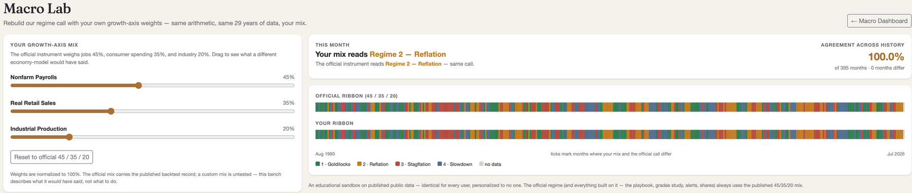
The classifier's whole parameter surface — three weights, two thresholds, one window length — fits in a sentence. That's what makes the Macro Lab possible: users can re-weight it live and rebuild 29 years of calls in the browser, running the same shared function the engine runs.
Calibration as Hypothesis Testing
The Macro Grade's factor bands began life explicitly labeled a hypothesis, then faced a 354-month replay of history. The chosen metrics matter as much as the result: recession lead time (a warning after the recession starts is worthless), false alarms grouped into eras (twelve consecutive alarmed months are one wrong opinion, not twelve), and regime balance (a classifier that lives in one class is a broken thermometer).
The draft failed — zero of three recessions warned — so candidate configurations competed on the same harness and the winner froze as bands v1.0, published with its failures: 2001 warned five months early; 2008 bottomed just above the warning line; 2020 was structurally unwarnable; one 2022–24 false-alarm era. Full story on Calibrate in Flight.
The same forecaster now runs over commodities — gold, silver, oil, copper and bitcoin — on the identical monthly ladder and under the identical entry fee. Bitcoin is the instructive case: its history is frequently too short to clear 120 monthly observations, so it ships with no projection at all and the page says so. An asset that cannot earn a forecast is more useful as a visible gap than as a number nobody should trust.
From Number to Meaning: the Interpretation Layer
A projection of “2.6–3.0%” tells a reader nothing about whether that is good
news. Turning a measurement into a reading is a separate problem from producing it, and it is
solved in a separate place: MacroTrendReading and CommodityTrendReading
live in the shared client library, so the customer portal, the admin portal and the mobile app
render identical stances and identical prose. Three copies of “is rising good?” would
have diverged inside a release.
Polarity is per series, never per arrow. Rising payrolls and rising unemployment both point up and mean opposite things; rising gold is a fear bid while rising copper is industrial demand. Colour follows the meaning rather than the direction, so a rising unemployment projection renders red with an upward arrow. The commodities pages previously coloured any positive year-over-year move green — which told a reader the exact opposite of the truth about gold, and is now fixed.
Some series are refused a verdict. Average hourly earnings, M2, home prices and the personal saving rate are genuinely two-sided, as are oil and silver: each is simultaneously a demand signal and something else, and a level alone cannot say which dominates. Those return “cuts both ways”. Declining to answer is a feature — a model that always has an opinion is one that will eventually be confidently wrong.
The direction call is delegated to the confidence band. A series is described as trending only when its projection band no longer contains today's value; otherwise it reads “holding steady”. The same rule drives the projected regime outlook, which pushes each axis's own inputs through their projections and reads the resulting quadrant — while stating plainly that a projected continuation carries almost no information, because extending the current trend is what trend extrapolation does by default.
Forecasting, Bounded: SSA With an Honesty Clause
The one place the platform projects forward, it does so with guardrails. Singular Spectrum Analysis (ML.NET's SSA implementation) decomposes each monthly series into trend and oscillatory components and extends them 12 months, published at the 1/2/6-month horizons with 80% confidence intervals drawn on the chart — the uncertainty is the product, not a footnote. SSA was chosen over regression or deep models for a data-science reason: 21 heterogeneous macro series with a few hundred observations each is exactly the regime where a nonparametric decomposition with a fixed seed beats anything with appetite for overfitting.
The honesty clause: a series needs ten years of history before it earns a forecast,
and any series whose model fails to converge ships with no forecast — never a fabricated
one. That clause was production-tested the hard way: a missing native math library
(libiomp5) silently disabled every forecast at launch, the engine degraded exactly as
designed, and the only symptom was warnings in a log — the war story lives on
Calibrate in Flight.
The Grades × Regimes Study: Point-in-Time or It Didn't Happen
The platform's largest study joins ~500 companies × 23 years of monthly returns to the regime timeline and to each company's reconstructed historical grade. Cross-sectional studies live or die on look-ahead hygiene, so the rules are mechanical: a fiscal year's grade takes effect the month after its actual SEC filing date (a March-filed 10-K never grades January); the analyst-target factor, which has no point-in-time archive, scores the formula's own neutral band for every historical year rather than a backfilled guess; and ungraded months are dropped, never defaulted.
The first production run promptly demonstrated why you run the study before writing the conclusion. The raw grid showed the lowest-graded cohort with the biggest average returns — a textbook survivorship artifact: the universe is today's index membership, so every company that wore a D or F in 2009 and still exists is, by construction, one that rebounded spectacularly; the ones that died aren't in the sample to answer for it. Eighty-seven crisis-concentrated companies were posing as an investment strategy.
The claim the data actually supports is narrower and more interesting: A-graded companies earned positive market-relative returns in every regime, and in the Slowdown regime they were the only meaningful cohort that did (+0.17%/mo vs the index while B and C ran −0.33 and −0.45). Marketing copy drafted before the run had claimed more; it was corrected to match the grid the same night. Sample sizes print on every cell in the product, and the survivorship caveat prints beside them.
Where the Discipline Lives in Code
None of this is notebook science — every method above is production C# with golden tests pinning
the arithmetic: DerivationService (transform chain), RegimeClassifier
(axes, bridge, Lab pack), MacroGradeScorer (config-driven bands),
BacktestHarness (the 354-month gauntlet + era-grouped false alarms),
MacroForecastService (SSA with the honesty clause), CommoditiesService
(the same forecaster over hard assets), RegimePlaybookService
(regime × sector joins with consecutive-month guards), and GradeRegimeStudyService
(point-in-time reconstruction). Eighty tests answer one question in different costumes:
would this formula lie politely if we let it?
Related reading: Macro Dashboard Architecture · Calibrate in Flight · Anatomy of the Macro Readout · Machine Learning · Data Provenance